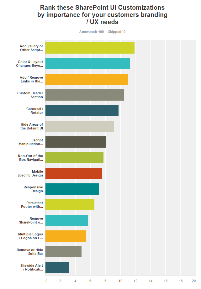
A number of months ago I posted about a survey where I asked the community to rank common branding & UI customizations by how important they are to you and your customers. My free SurveyMonkey usage only allows me to see the first 100 of the 150 submissions but I have included a chart of the results below.
Clearly jQuery is a biggie, but also not surprisingly a solution for changing color and layouts beyond themes / composed looks is a solid second place. It’s interesting to see a good cross section of the community and what ideas have floated to the top.
Check out the results:
(Updated to include readable list since the chart cuts the text off)
- Add jQuery or Other Script Libraries
- Color & Layout Changes Beyond Themes / Composed Looks
- Add / Remove Links in the Suite Bar
- Custom Header Section
- Carousel / Rotator
- Hide Areas of the Default UI
- Jscript Manipulation of HMTL DOM Elements
- Non-Out of the Box Navigation / Mega Menus
- Mobile Specific Design
- Responsive Design
- Persistent Footer with Customizable Links & Text
- Remove SharePoint or Office 365 Branding from Suite Bar
- Multiple Logos / Logos on Left & Right
- Remove or Hide Suite Bar
- Sitewide Alert / Notification Area