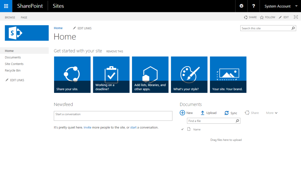
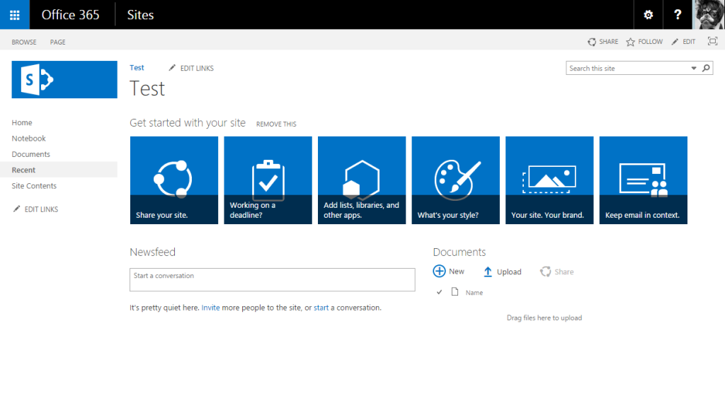
If you haven’t heard the news, this week Microsoft released the SharePoint Server 2016 IT Preview bits for you to download and try out in your on premises farm. Readers of my blog are probably most interested to know how this update affects the UI and customization story for SharePoint. The good news is that at this point, SharePoint Server 2016 looks remarkably similar to an Office 365 SharePoint Online site. The biggest difference you will immediately notice is the Suite Bar or Ribbon at the top of SharePoint has evolved to a more modern look with the App Launcher, affectionately known as the “Waffle Menu” (I’m still waiting for my royalty checks for bringing waffles to SharePoint, but that’s another story).
In fact, if you are used to customizing Office 365 master pages and CSS, you will notice that Seattle.master and CoreV15.css are identical between the SharePoint 2016 IT Preview and SharePoint Online. Of course, since O365 is always evolving they could deviate again before the next preview, but for now they match exactly.
Here is a screenshot of my homepage in the SharePoint Server 2016 IT Preview:
Compare that to my Office 365 SharePoint Online site:
Looks pretty similar right? Let me know in the comments or on Twitter what you think about the UX direction that Microsoft is going with next version of SharePoint!

