I was doing some research on Silverlight charting solutions for SharePoint when I stumbled across VisiFire an open source self contained charting solution built with Silverlight. If you haven’t seen VisiFire before, it’s worth checking out, their gallery page shows a number of really slick animated charts that are dead simple to use with XML data (without writing any Silverlight code).
Also, I’m not sure what rock I was under when the SharePoint Designer team posted this blog entry on integrating the Data View Web Part with VisiFire using XSLT. Their example uses the 1.0 version of VisiFire, so I decided to do a little poking around to see if I could get the 2.0.9 Beta version (hopefully my XSLT will also work when the official 2.0 version is released). Here are instructions for getting it to work in SharePoint (influenced HEAVILY by the original post by the SharePoint Designer Team:
- Download the 2.0.9 Beta version (or whatever the latest is) from here: http://visifire.com/download_silverlight_charts.php
- Create a page in SharePoint that will hold a Data View Web Part
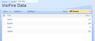
- Create a simple list with a “Title” field (which is already created by default) and a “Value” field of type Number
- Enter a few rows of fake data into the list
- Unzip the VisiFire package that you downloaded and grab “Visifire2.js” and “SL.Visifire.Charts.xap” and add them to the same location as the page you just created in your SharePoint site
- Add the Data View Web Part to you page. You can use SharePoint Designer for this, with a Web Part Zone selected, from the top menu click Data View > Insert Data View. From the Data Source Library in the right hand task pane select your list and click Show Data. Then select both the Title and Value fields and add them to the Data View.
- Next, make sure you are in Code View and replace the first xsl:template:
With this XSLT:
var xmlString = ' <\/xsl:for-each><\/p>
' + ' <\/vc:DataSeries>' + ' <\/vc:Chart.Series>' + ' <\/vc:Chart>';
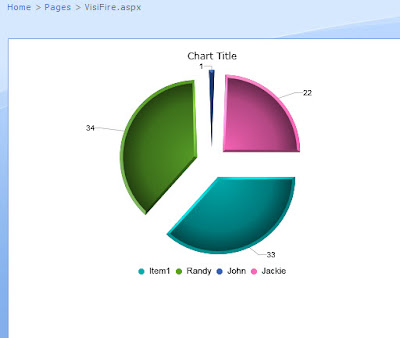
]]> - Save the file and refresh the page in a browser and you should see a pie chart come to life animated. If you make any mistakes the VisiFire widget is kind enough to give you a line number and position where it blew up, so that can be a help in tracking down typos in the notoriously picky XSLT. From here you can check out the other charts and other options via the VisiFire documentation which btw is really easy to read.