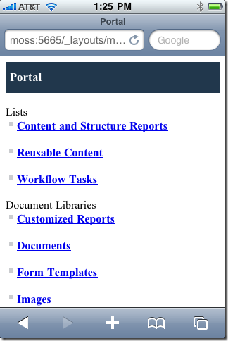
One interesting feature of SharePoint 2010 is that it automatically shows a nice mobile experience when mobile devices browse the site. There is no need to type in the mobile URL (by appending /m to the URL) as you had to in SharePoint 2007. Here is a screenshot of what the SharePoint site looks like on my iPhone, I simply navigated to the usual site URL:
While this is terrific for intranet sites, its less than ideal for public internet sites, especially ones that have a lot of custom branding. In those cases, typically you would want smart phones like the iPhone to see a standard rendering of your site. So, how do we turn off the automagic mobile experience? There doesn’t appear to be a setting for this in the Site Settings or in Central Administration. I had to ask around on this one, and the SharePoint product team was kind enough to point me in the right direction. Turns out you need to edit the “compat.browser” file for your SharePoint site. To find this file, look in your IIS directory for your SharePoint site and look for the App_Browsers folder. Mine file was located at:
C:\inetpub\wwwroot\wss\VirtualDirectories\portal.contoso.com80\App_Browsers\compat.browse
This file has settings for MANY popular browsers, including most mobile browsers. In my example I want to change the mobile setting for the iPhone browser so I found this section:
To turn OFF the automatic mobile version of the site for this phone, we just need to change isMobileDevice from True to False and save the file. With the isMobileDevice set to false, now when I browse my SharePoint site I see the standard branding:

