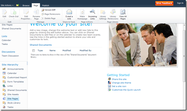
In the 2010 out of the box master pages, Microsoft has included code that causes the ribbon to float above the rest of the page content (you might say it sticks to the top of the page). You can see the effect here:
See how the right scroll bar stops at the ribbon? That’s the new functionality at work. It makes editing the page a nicer because you don’t have to scroll to the top of the page constantly.
But what if you are doing a VERY stylized branded SharePoint site? Sometimes this functionality can get confused, especially if you are using CSS to position the body “fixed”. I saw this happen recently when Paul Keijzers (@KbWorks on Twitter) was having problems using my Starter Master Pages (http://startermasterpages.codeplex.com). His problem would have been the same if he used Microsoft’s v4.master.
So, how do we make the page scroll in a more traditional fashion? Pretty easy, just follow these steps in your custom master page (or css):
- Remove or override the CSS that hides the body overflow – body { overflow:hidden; }. You can override with body { overflow:auto; } Note: if you are using v4.master, you need to override this with body.v4master { overflow:auto; }
- Remove scroll=”no” from the tag
- Remove ID=”s4-workspace” from the
tag that surrounds the page content (below the ribbon). You can remove the entire <div> tag and its corresponding </div> if you would prefer.
Save and check-in / approve and you should have a page that scrolls normally. The ribbon will stay at the top and scroll off the page if you have a lot of page content. Note, there may be an easier way to do this by using something like the class=”s4-nosetwidth” code that takes away the width setting, but I haven’t been able to find anything that would change the scrolling behavior.
