As you probably know the SharePoint 2013 Public Preview was released this week and I’m sure all the designers out there want to know what’s new for branding? Well, you will be interested to know that making SharePoint design easier was a key goal for this version of SharePoint. Does that mean that all my professional branding peers are out of work now? Let’s check out what’s new and then revisit that question. Be sure to scan down the page, I save the most interesting for last (sort of like a David Letterman Top 10 list!).
6 – Managed Navigation – SharePoint navigation now has two different options: the old way, now known as Structured Navigation and the new way which is known as Managed Navigation. 
This new method of navigation uses a Managed Metadata term set to populate the navigation control with items. The new method is more flexible and allows for some interesting new uses as you will see including allowing you to make friendly URL’s. Another interesting side benefit of Managed Navigation is you get a nifty Edit button next to the both the Global and Current navigation that lets you add, remove, and edit navigation from anywhere without visiting the Navigation option in the Site Settings. ![]()

Side Note: Styling this edit mode is going to be a bit of a pain on sites with highly stylized navigation… but that’s a good topic for a future post!
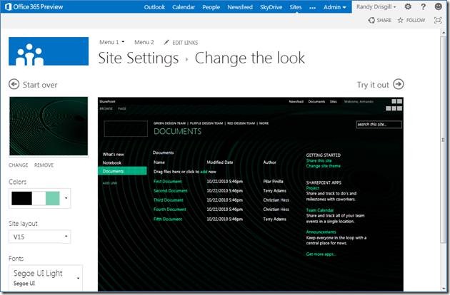
5 – Composed Looks – I’m thinking of Composed Looks as evolution of SharePoint 2010 themes… I imagine the product team was trying to make something a little closer to how Word Press themes work(though without changing the underlying SharePoint technologies that make up the look and feel). 
The first big difference is you don’t make the themes with the Office client anymore. Instead you configure elements and add them to a Composed Looks Gallery (Site Settings > Composed looks). The composed look consists of several things:
- Name – Fairly obviously the name of the Composed Look
- Master Page – To arrange the elements of the page and do other master page-y stuff
- Theme URL – Points to an XML file that defines all of the colors you want to apply to different CSS. This works similarly to 2010 except you make your own theme id’s instead of using Accent1, Accent2, etc.
- Image URL – Points to an image that can be used to replace a background image in the CSS (I know… sweet… a background image!)
- Font Scheme URL – Points to an XML file which defines the fonts that can be applied to CSS
- Display Order – Helps you arrange the available composed looks
The idea here is that you put all this together with a preview file and you can provide configurable “composed looks” for your clients and users to select from and configure to their liking. You can apply Composed looks from Site Settings > Change the look.
4 – Device Channels – Don’t be fooled by the name, this has nothing to do with channels as you may know them… we are talking mobile / device specific page rendering here!
You setup Device Channels from Site Settings > Device channels, which allows you to give the channel an Alias (for referencing in the UI and in code) and then “Device Inclusion Rules”. These rules are substrings that SharePoint will look for in the browser’s User Agent. You can have certain master pages apply to certain device channels (for example: have a specific master page just for iPhones or Surface Tablets). This is a pretty cool feature, you can even use the Alias in your master page and page layouts to have different individual pieces of the page render differently based on the channel. It’s kind of like Media Queries in CSS3 only Device Channels don’t look at device capabilities (like width and height) they look for keywords in the browser’s User Agent.
3 – Web Content Management enhancements – There are probably several enhancements that are new to SharePoint 2013 WCM but the two that stand out to me are: Content Search Web Part and Catalogs.
- Content Search Web Part – A new Web Part that supersedes the old Content Query Web Part. As the name implies the new Web Part uses the search functionality in 2013 to query and filter information from around SharePoint. Unlike the CQWP, the Content Search Web Part is styled with HTML and JavaScript instead of XSLT.
- Catalogs – In SharePoint 2013 WCM you can create a catalog of products and use this catalog to create a robust product web site without creating pages for every item. Imagine having product categories, sub categories, and product detail pages all centrally managed!
I could probably fill an entire blog post on the new WCM features, but I’ll let someone else take that charge 🙂
2 – No more SharePoint Designer for creating SharePoint branding! – Sure SharePoint Designer was updated for 2013 but you don’t have to use it to edit your branding anymore (I’m thinking the name SharePoint “Designer” is no longer appropriate!). In fact you can use any tool you want, including Visual Studio, Notepad++, Dreamweaver… ANYTHING. This feature works because the Master Page Gallery was updated to work seamlessly over a WebDAV mapping. So now, in Windows you can map a network drive directly to your Master Page Gallery and then edit away. Truth be told you could do this to some degree in previous versions of SharePoint, but back then Microsoft locked SharePoint from allowing you to work with master pages and page layouts.
In 2013 the Master Page Gallery is the place where you can put ALL your branding assets including CSS and images. This is a pretty interesting change that takes a little getting used to… but it really is a lot nicer than being forced to use SharePoint Designer or a plugin to Visual Studio to work with your branding files directly on the Site Collection.
Note: I’ve noticed that sometimes WebDAV can be slow. There is a strange but easy fix to this, see the following post: http://oddballupdate.com/2009/12/18/fix-slow-webdav-performance-in-windows-7/ After making this change my mapped drive to SharePoint is super-fast!
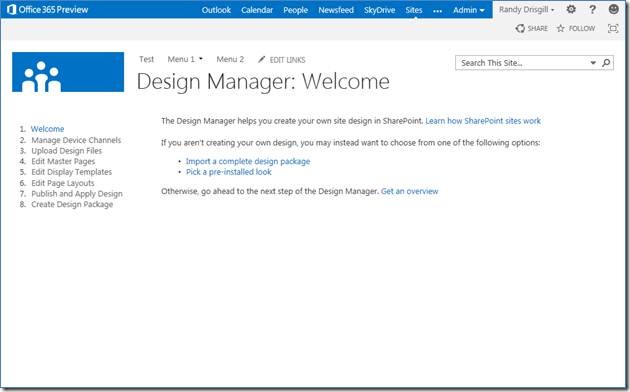
1 – Design Manager – I saved the most interesting for last! This new feature is so important that Microsoft even added it as a top level selection under Site Actions in Publishing sites! It includes links to a lot of common design tasks including some of the previous topics I’ve discussed but it also includes the following new features:
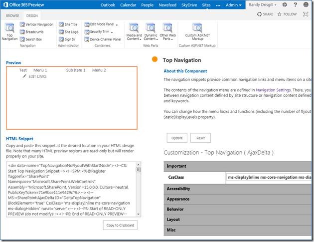
- Create and Edit Master Pages – This is probably the biggest change for SharePoint branding folks. From here you can create a minimal master page or convert an existing HTML design. Did that get your attention? Yes, you can actually add an HTML design with CSS and images to the Master Page Gallery and then use this feature to convert it to a functioning master page. You also get a preview of the new master page and a snippet gallery that allows you to copy and paste SharePoint functionality (like navigation, search, web parts, etc.) right into your HTML based design.
You no longer have to edit .master files; you can continue editing your HTML file in whatever editor you like and every time you hit save SharePoint will notice the changes and update the corresponding .master file.
Does this mean that SharePoint branding is so easy now that anyone can do it? Yes and no, if you need to make a branded SharePoint site you probably can do it all from the Design Manager with converting an HTML design and using snippets. However to make a fully branded portal or web site you will still need to understand a lot of SharePoint CSS and you still need to understand how Content Placeholders and a variety of other SharePoint specific technology works.
I’ll be very curious to see how the SharePoint branding community reacts to this feature and see where we land with what newcomers can do with SharePoint branding on their own. I tend to think the Design Manager is a great starting point that changes things so that there is no middle level effort branding… either there is branding that anyone can do with the Design Manager or there is advanced branding that you need to understand the underpinnings in order to make things work the way you want.
- Create and Edit Page Layouts – When you create a page layout from the Design Manager you get an HTML file that contains a minimal page layout and all the fields that come from the content type that you base the page layout on. When you make changes to this HTML file the corresponding .ASPX page layout is updated behind the scenes
- Create a Design Package – Export your entire design from one place to another (even a completely different server). You can then import the design package to another site collection or server from Site Actions > Import Design Package.
Well, that’s the end of the Top 6 list. I invite you to discuss these features as you start to play with them. Do you think the Design Manager is an end-to-end branding solution or are is it more like a really great kick start to the SharePoint branding process? Let me know in the comments!
You can bet I’ll be back with more SharePoint 2013 content in the near future but I wanted to get this list up now that the public beta was released.
For more information about some of these features, check out Microsoft’s article:
What’s new in web content management for SharePoint 2013 Preview publishing sites http://technet.microsoft.com/en-us/library/jj219688(v=office.15)#BKMK_contentsearch

