As many of you may be aware, Microsoft pushed out a UI update for Document Libraries in Office 365 SharePoint Online last week. Of course my first thought is to wonder how this impacts the custom branding story. Let’s find out together!
Note: I have an obnoxious theme applied with Oslo master page just to put this through the paces… no commenting on how ugly it is!
First let’s look at how the new update reveals itself in SPO. I assume you need to have First Release turned on in order to even see this:
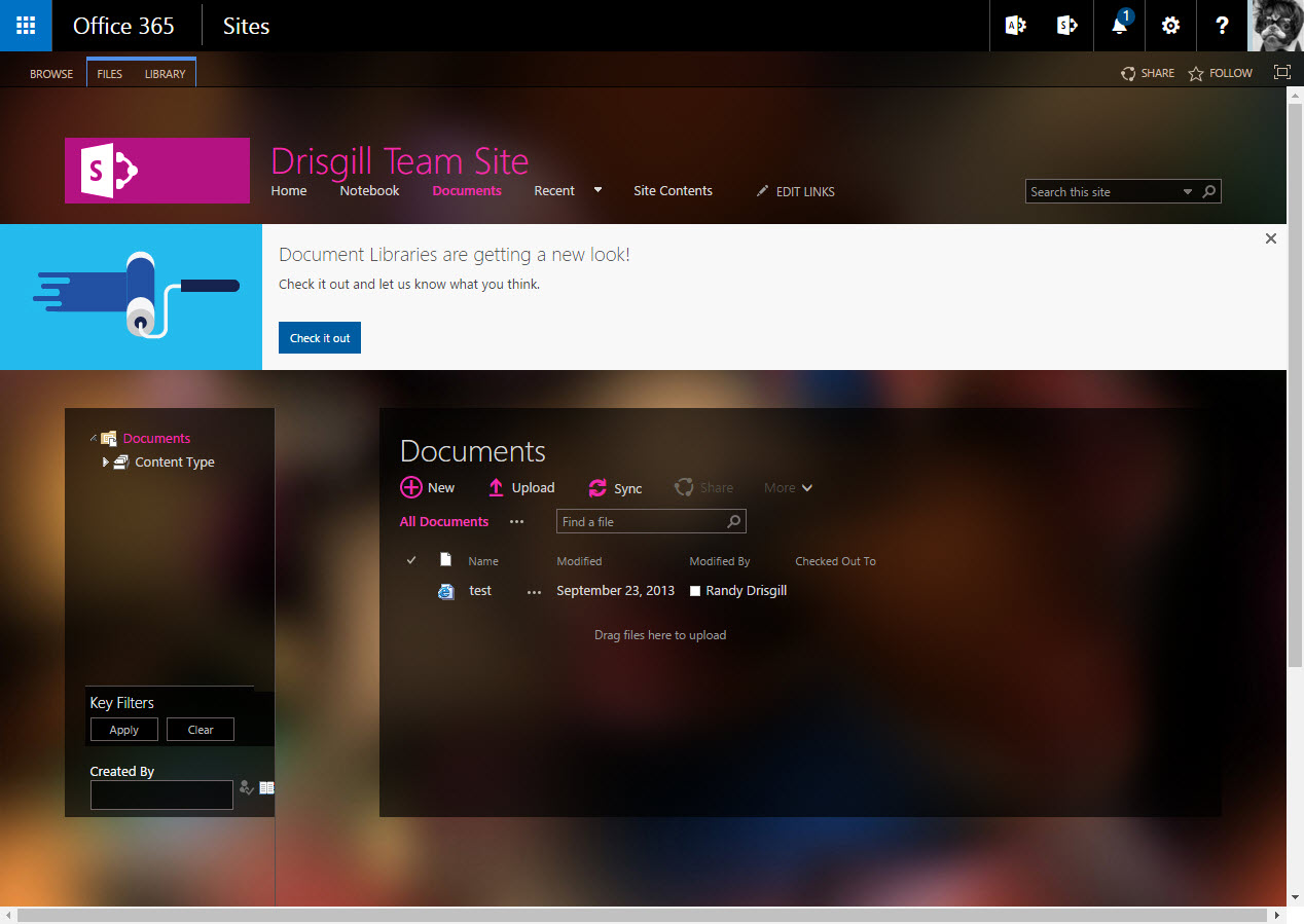
Check out that snazzy banner! It’s worth noting that if you have a custom master page installed you will need to have <div id=”pageStatusBar”></div> in said master page before you will see the banner. When you click “Check it out” you will be presented with a new modern UI experience with a new clean layout and the ability to switch on a big grid of document icons. But as you will see in the next screenshot we not only lose our Oslo master page but we also lose the theme that I applied as well:
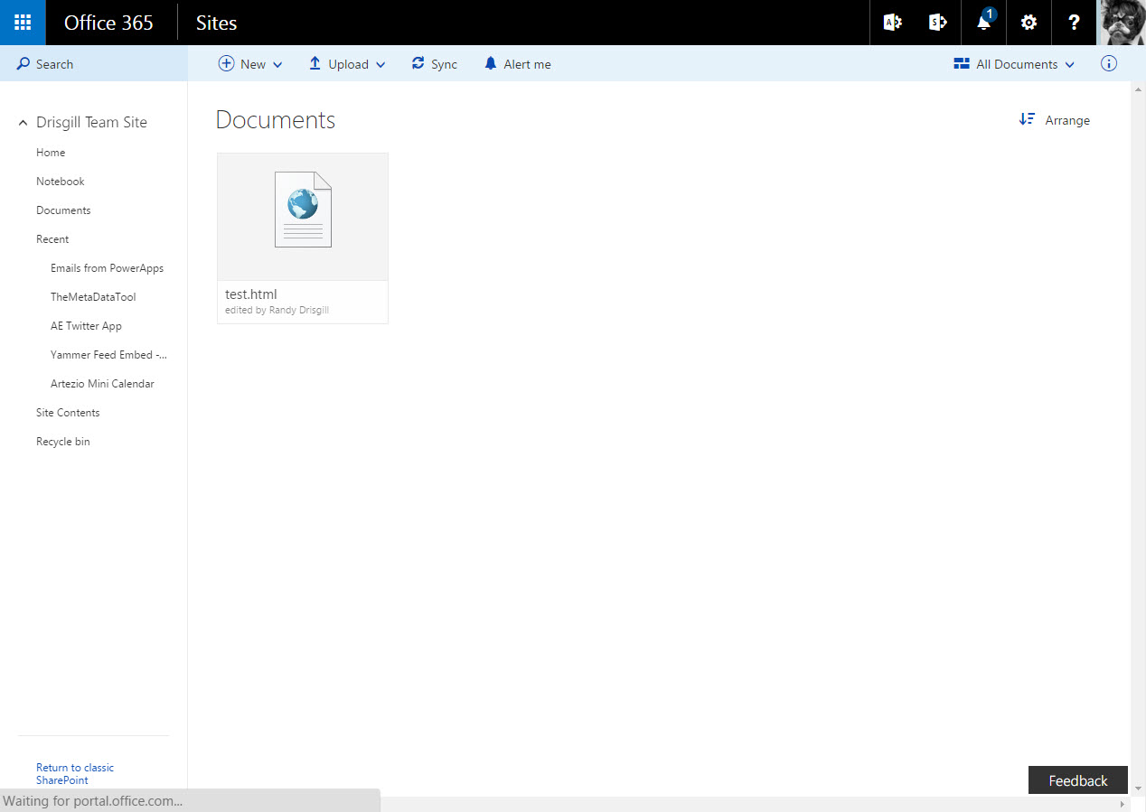
Why do we lose all of our branding? I suspect this is what Microsoft refers to as a “railed (or on rails) experience”. In other words it’s just meant to be used and not customized… much like the OneDrive experience today. Note: I have no idea if they will add customization options in the future or not for this modern UI.
If we view source on the page, we see some really interesting HTML. If you are used to what the current version of SharePoint 2016 or 2013 pumps out for HTML from the legacy ASP.net master pages you might be in for a shock:

Wow! That looks like a lot of lines of code… but wait, it’s not actually a lot of lines, it only has about 15 lines total! What you are seeing is many many lines of JavaScript configuration minimized into a few lines. Looks kind of like they are using the Knockout JavaScript libraries… perhaps other modern scripts as well!
Welcome to the brave new world of SharePoint Online, based on modern web development methodologies! How do we customize it? I have no idea at this point… stay tuned!
What if you want to go back to the old look and feel? Thankfully (for now at least) Microsoft gives us a link in the lower left-hand corner “Return to classic SharePoint” that will revert the experience back to the same old lovable customizable SharePoint experience.
What do you think of this update… awesome usable out-of-the-box UI or not flexible enough for real work?